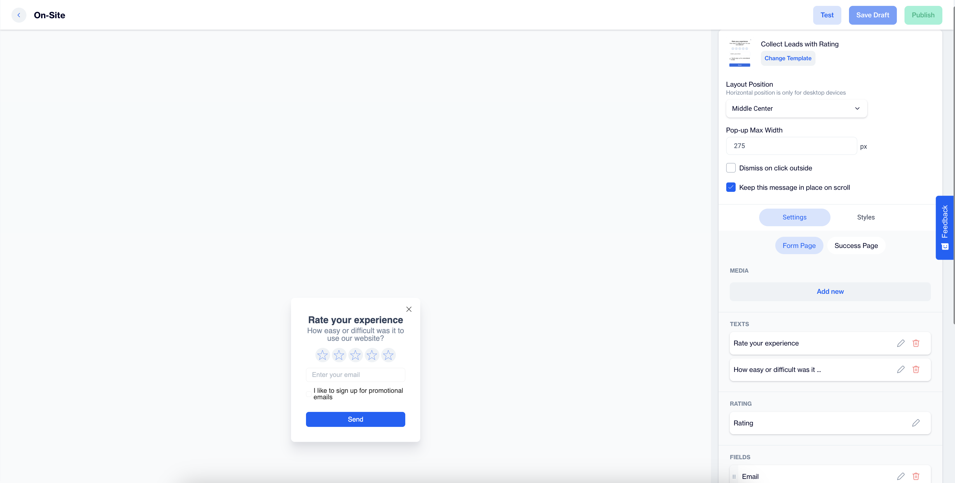
Collect Leads with Rating
The Collect Leads with Rating is an on-site element designed to engage visitors by gathering feedback through a rating system. This popup encourages user interaction and helps collect subscriptions based on user ratings.
Creating Collect Leads with Rating
Collect Leads with Rating
Preview on Desktop or Mobile:
After selecting the Collect Leads with Rating template, users will see a preview on the left side of the screen, showing how the popup will appear on both desktop and mobile devices.
General Section
As with other on-site elements, the General Section is where users input the Name and Folder details to ensure the Collect Leads with Rating content is well-organized and easy to manage.
Content Section
- Change Template: Users can switch between different templates by clicking the Change Template button, allowing flexibility.
- Layout Position: In the Layout Position dropdown, users can select various placement options (e.g., middle center, top right) based on where they want the rating popup to appear on the page.
- Pop-up Max Width: Set the desired width of the popup for a seamless fit within the page’s design.
- Dismiss on Click Outside: Enable this option to allow users to close the popup by clicking outside of it.
- Keep This Message in Place on Scroll: Toggle this option on to ensure the Collect Leads with Rating popup remains visible as users scroll down the page.
Settings
Form Page
Media:
- Position: Users can choose the position of the media within the form, such as left, top, or right of the content.
- Media Type: Users can select the type of media to display, either an image or video.
- Source: Users need to provide the media source, with customization available using the Customization Selector for dynamic and personalized content.
Texts:
- Title: The title text, such as "Rate you experience" can be edited by clicking the pencil icon.
- Message: Users can edit the message, like "How easy or difficult was it to use our website?" The Customization Selector allows for personalized content.
Rating
- Size; Select the size of the rating element to fit your design preferences.
- Primary (Color); Choose the primary color for the rating element to align with your brand or design theme.
- Secondary (Color); Set the secondary color for the rating element for contrast and visual appeal.
- Tag; Select a tag to save the rating. Tags help categorize or identify users based on their rating behavior.
- Add Tag:
- Tag Name: Enter a name for the tag.
- Tag Type (Key Value): Define the tag type based on a key-value structure, where the tag identifies the key, and its value provides further details.
- Value Type: Choose the Value Type as either TEXT or INTEGER, depending on whether the value needs to be treated as a text or a numeric value.
- Description: Provide a description to clarify the tag's role or usage.
- Audience Type: Specify if the tag applies to Contact Specific (individual user profiles) or Device Specific (applied to a specific device).
Fields:
- Email; The primary field for collecting the respondent’s email address for future communication and follow-ups.
- Phone number; Collect the respondent’s mobile phone number (GSM) for SMS communication and personalized outreach.
- Name; Users can gather the respondent’s first name to personalize any follow-ups or future communications.
- Surname; This field captures the respondent’s last name, allowing for more personalized and professional communication.
Validation Language:
- In the Validation Language section, users can choose the language for validation messages that appear when subscribers interact with the form. The available language options are: Turkish or English
Checkbox Type:
- Merged Permission Checkbox; When both the Email and GSM (Phone number) fields are selected, this feature will merge the permission checkboxes into one. This single checkbox will allow users to opt-in for both email and SMS communications simultaneously.
Checkboxes:
- If the Merged Permission Checkbox is enabled, users will see a combined opt-in for both SMS and email messages. If it’s not enabled, separate checkboxes will be displayed for each communication method, allowing subscribers to opt in individually.
Button:
- Text: Users can edit the Send Button text to align with their campaign, such as "Send" or any other action-oriented text that fits the context of the survey or form.
- Customization; Apply dynamic content using the Customization Selector to personalize the button text.
Success Page:
Successful Content:
- Close Automatically: Users can enable or disable the option to automatically close the success message. If enabled, they can specify the time in seconds before the message closes.
- Message: The default success message, such as “The form is submitted successfully,” can be customized. Users can modify the text, add emojis, or use personalized content for enhanced engagement.
- Icon: An icon can be added to the success page to enhance visual appeal. If no custom icon is selected, a default one will be used.
- Image: The form image will automatically be displayed on the success page.
After making changes, users must click the Save & Back button to return to the previous screen.
Styles:
- General: Users can select a font family, input a Font URL, and adjust the card’s radius and padding for optimal spacing. Customization options for background and close button colors are available for a cohesive design.
- Title: Customize the title’s color, font size, alignment, and font weight to ensure it's engaging.
- Message: Adjust the message’s color, font size, alignment, and font weight for clarity.
- Inputs: Modify the input fields' padding, background color, and font size to ensure readability and alignment with the overall design.
- Checkboxes: Style the checkbox, tick mark, background, font size, and borders for better clarity.
- Submit Button: Customize the submit button’s text, alignment, font size, background color, and border radius for a modern design.
- Successful Content: Style the success message by adjusting color, font size, alignment, and padding for a visually appealing confirmation message.
After adding your content successfully, save it as a draft for future use or publish it to make it ready for your campaigns.
Related Articles
Collect Leads with NPS
The Collect Leads with NPS is an on-site element designed to capture user feedback through a brief survey that measures user loyalty and satisfaction. This popup is ideal for collecting leads while engaging visitors with a quick NPS survey. Creating ...Survey
The In-App Survey feature is designed to collect visitor feedback directly within the app, enabling engagement and insights through a single-question format. Creating a Survey Survey Name: Input the name for your In-App Survey to ensure it is easily ...Microsoft Dynamics 365
This guide explains how to integrate Microsoft Dynamics 365 by setting up an application in Azure, configuring permissions, and creating an application user in the Power Platform Admin Center. Step 1: Sign in to Microsoft Dynamics 365 Go to ...Full Screen
The Full Screen is designed to provide a visually engaging experience for users by presenting both an image and text across the full screen. Creating a Full Screen Full Screen Name: Enter a name for your Full-Screen to easily identify it in your list ...Image Modal
Image Modal The In-App Image Modal is designed to display an image alone within the app, providing a simple yet effective way to showcase visuals for promotions or announcements. This template maximizes visibility and is effective for visual ...