Push Channel Report
The Channel Report page helps you track and analyze the performance of your push campaigns. Follow the steps below to access and navigate the report.
1: Access the Channel Report
- Go to the Analytics section on the main page.
- Click Report > Flow > Channel Report.
2: Understand the Top Section of the Report
At the top of the Channel Report page, you will see a message:
"Email reports are listed. You can switch channels via the filter button. All metrics are calculated based on unique values."
This tells you that the current view is for email campaigns and reminds you that all metrics are based on unique values. You can switch to push channel using the filter button.
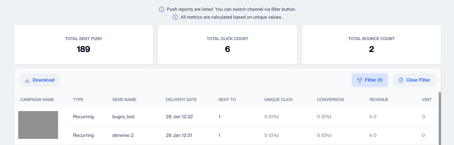
Push Metrics
3: Review Overall Metrics
Just below this message, you will see a summary of key metrics for all your push campaigns:
- Total Sent Push: The total number of push notifications sent.
- Total Click Count: The total number of clicks on push notifications.
- Total Bounce Count: The number of push notifications that couldn’t be delivered.
4: View Campaign-Specific Details
Below the summary metrics, there is a detailed table for each push campaign. Here’s what each column represents:
- Campaign Name: The name of the push notification campaign.
- Type: Whether the campaign is a one-time or recurring push campaign.
- Delivery Date: The date the push notification campaign was sent.
- Sent To: The number of recipients the push notification was sent to.
- Unique Click: The number of unique users who clicked on the push notification.
- Conversion: The number of users who completed the desired action after receiving the push notification.
- Revenue: The total revenue generated from the push campaign.
- Visit: The number of visits to the targeted site or app triggered by the push notification.
5: View Campaign Reports
If you want to dive deeper into a specific campaign’s performance:
- Double-click on the Campaign Name in the table.
- You will be directed to a Send Details page for that specific push campaign, where you can see more in-depth metrics.
Send Details
This page provides a detailed breakdown of your push campaign's performance across two key sections:
- Summary
- Push Clients
1. Summary
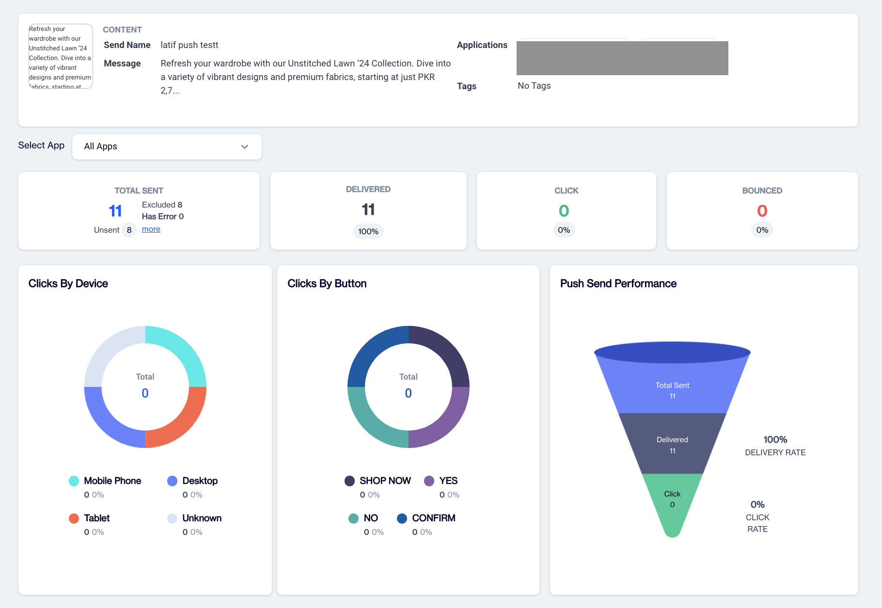
Push Summary
In the Content section, you'll find key information related to the content of your push campaign:
- Send Name: The name that appears on the recipient's device as the sender of the push notification.
- Message: The content of the push notification that was sent to the recipient.
- Application: The specific application(s) selected for delivering the push notification.
- Tags: Any tags or labels associated with the campaign, used for categorization and tracking purposes.
Select App
By clicking the "Select Application" button, a dropdown menu appears, allowing users to choose a particular app or select "All Apps" to view metrics across all applications. This feature helps users analyze performance based on the selected app(s), offering a more detailed or comprehensive view of campaign metrics.
The Metrics section provides key performance statistics for your push campaign:
- Total Sent: Total number of push notifications sent. This section also includes a breakdown of why certain notifications were not sent, including:
- Excluded: Notifications not sent because the audience was excluded based on predefined criteria, such as frequency capping.
- Has Error: Notifications that encountered errors during the sending process and were not delivered.
- Token Empty: The contact's device does not have a valid push notification token, making delivery impossible.
- Token Duplicate: Duplicate tokens found, meaning multiple entries for the same device or browser, which can result in only one notification being sent.
- Token Status Passive: Notifications were not sent because the token was marked as passive, indicating that the device or browser has not been active recently.
- Token Permission Passive: Notifications could not be delivered because the recipient has revoked or not granted permission for push notifications.
- Delivered: The number of successfully delivered push notifications.
- Click: The total number of clicks from recipients engaging with the push notification.
- Bounced: The number of push notifications that could not be delivered due to issues like invalid tokens or device errors.
The Clicks By Device graphic displays the distribution of push notification interactions across different devices. It shows the number and percentage of clicks for each device type:
- Mobile: Clicks from mobile phones.
- Tablet: Clicks from tablet devices.
- Desktop: Clicks from desktop or laptop computers.
- Unknown: Clicks from devices where the type could not be identified.
The Push Send Performance cone chart, located next to the Clicks By Device graphic, presents key metrics for your push campaign, including:
- Total Sent: The total number of push notifications sent.
- Delivered: The number of successfully delivered push notifications.
- Click: The number of notifications that were clicked by recipients.
Additionally, the chart includes the Delivery Rate and Click Rate to give you insights into the effectiveness of your campaign.
2. Push Clients
Select App
In the Push Clients tab of the analytics page, users can filter metrics by selecting a specific application using the Select App dropdown at the top. Once an app is selected, the metrics will update to reflect the performance for that particular application.
Applications
The first part of this section is called Applications. Here, you will find:
- Application Name: The name of the selected application.
- Delivery Count: The number of push notifications successfully delivered for that application.
- Click Count: The number of times users clicked on the push notifications sent from the application.
Next to this information, a graphical representation provides a visual summary of delivery and click performance for the selected app.
Device Types
In the Device Types section users can view the performance of their push campaigns based on different device types. This section displays:
- Device Type: Lists the various types of devices (e.g., mobile, tablet, desktop) that received the push notifications.
- Delivery Count: The number of push notifications successfully delivered to each device type.
- Click Count: The number of times users clicked on the push notifications from each device type.
This information helps users understand how different devices contribute to the success of their push campaigns. A graphical representation is also available to provide an easy-to-interpret summary of these metrics by device type.
Operating System
In the Operating System, users can analyze the performance of their push campaigns across various operating systems. This section provides:
- Operating System: Lists the different operating systems (e.g., iOS, Windows) that received the push notifications.
- Delivery Count: The number of push notifications successfully delivered to each operating system.
- Click Count: The number of times users clicked on the push notifications sent to devices running each operating system.
This allows users to track how well their campaigns perform across different platforms and operating systems, offering valuable insights into user engagement based on OS preferences. Graphical data is also available for a visual comparison of these metrics.
Device Brands
In the Device Brands section users can evaluate the performance of their push campaigns based on different device brands. This section includes:
- Device Brand: Lists various device brands (e.g., Apple, Huawei) that received the push notifications.
- Delivery Count: The total number of push notifications successfully delivered to devices from each brand.
- Click Count: The number of times users clicked on the push notifications received on devices from each brand.
This data helps users understand how their campaigns are performing across different brands, allowing for targeted strategies based on brand-specific engagement. Visual representations are also provided for easier analysis of these metrics.
Browser
In the Browser section users can analyze the performance of their push campaigns based on the browsers used by their audience. This section includes:
- Browser Name: Lists the different web browsers (e.g., Chrome, Safari) that received the push notifications.
- Delivery Count: The total number of push notifications successfully delivered to users on each browser.
- Click Count: The number of times users clicked on the push notifications while using each browser.
This information provides insights into how effectively the push notifications are reaching users across various browsers, allowing for optimization of future campaigns based on browser performance. Visual representations accompany these metrics for enhanced clarity.
Related Articles
Push Detailed Report
To access the Detailed Report in the Analytics section, navigate to Campaign > Flows and click on your campaign name to view the report. Alternatively, you can click on the three dots at the end of the campaign row and select Flow/Analytics to open ...Email Detailed Report
To access the Detailed Report in the Analytics section, navigate to Campaign > Flows and click on your campaign name to view the report. Alternatively, you can click on the three dots at the end of the campaign row and select Flow/Analytics to open ...SMS Detailed Report
To access the Detailed Report in the Analytics section, navigate to Campaign > Flows and click on your campaign name to view the report. Alternatively, you can click on the three dots at the end of the campaign row and select Flow/Analytics to open ...On-site Detailed Report
To access the Detailed Report in the Analytics section, navigate to Campaign > Flows and click on your campaign name to view the report. Alternatively, you can click on the three dots at the end of the campaign row and select Flow/Analytics to open ...In-App Detailed Report
To access the Detailed Report in the Analytics section, navigate to Campaign > Flows and click on your campaign name to view the report. Alternatively, you can click on the three dots at the end of the campaign row and select Flow/Analytics to open ...