Survey
The Survey is an on-site element designed to gather visitor feedback through a single question. This popup is ideal for quickly engaging visitors and collecting valuable insights based on their responses.
Creating Survey
Survey
Preview on Desktop or Mobile:
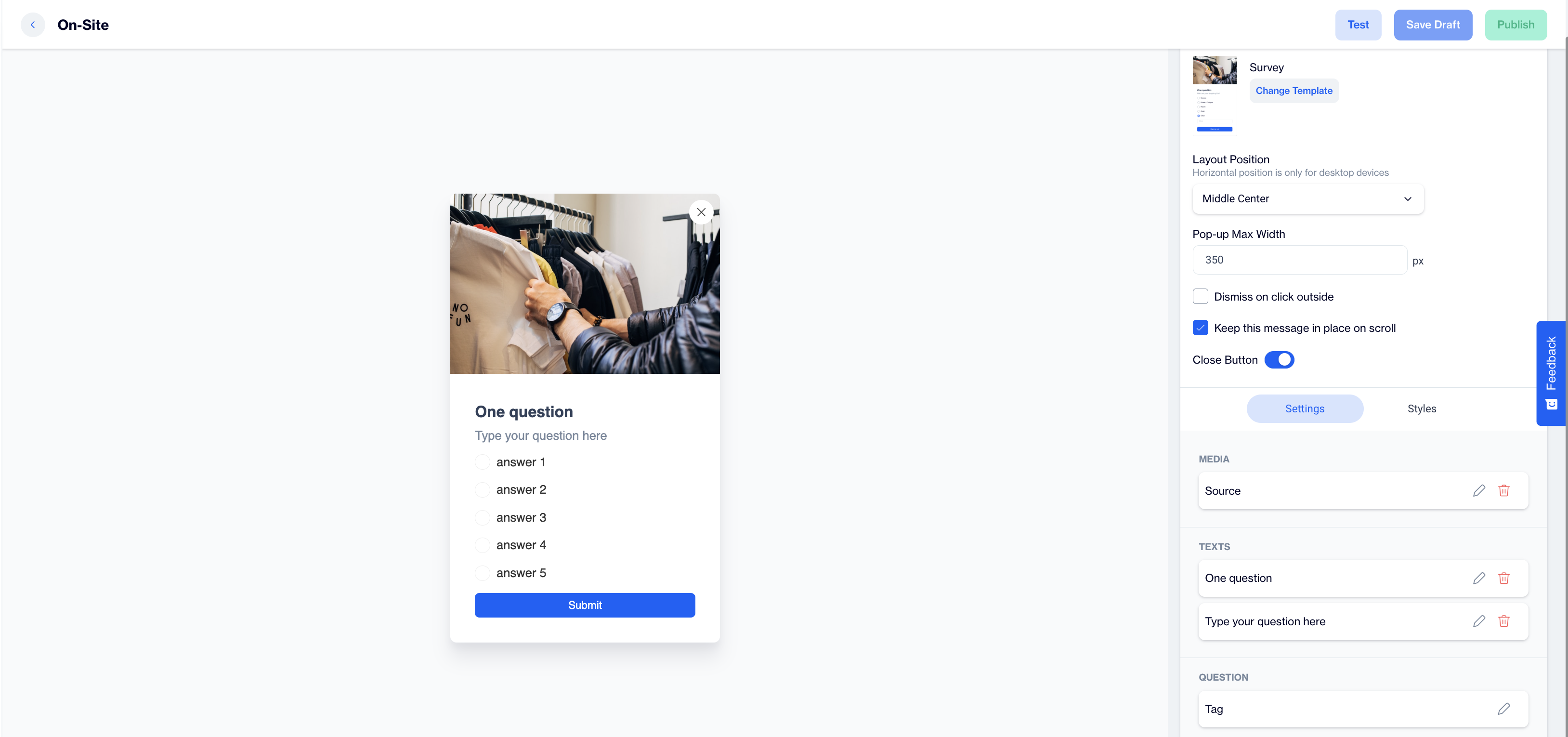
After selecting the Survey template, users will see a preview on the left side of the screen, showing how the popup will appear on both desktop and mobile devices.
General Section
As with other on-site elements, the General Section is where users input the Name and Folder details to ensure the Survey content is well-organized and easy to manage.
Content Section
- Change Template:
Users can switch between different templates by clicking the Change Template button, allowing flexibility. - Layout Position:
In the Layout Position dropdown, users can select various placement options (e.g., middle center, top right) based on where they want the survey popup to appear on the page. - Pop-up Max Width:
Set the desired width of the popup to ensure it fits seamlessly within the page’s design. - Dismiss on Click Outside:
Enable this option to allow users to close the popup by clicking outside of it. - Keep This Message in Place on Scroll:
Toggle this option on to ensure the Survey popup remains visible as users scroll down the page. - Close Button: Toggle on the Close Button option to allow users to dismiss the survey.
Settings
Media:
- Position: Users can choose the position of the media within the form, such as left, top, or right of the content.
- Media Type: Users can select the type of media to display, either an image or video.
- Source: Users need to provide the media source, with customization available using the Customization Selector for dynamic and personalized content.
Text:
- Title: Displays a default prompt, "One Question," which can be edited to suit the purpose of the survey.
- Message: Shows a placeholder text, "Type your question here," where users can input their specific question for the survey.
Question:
- Tag: Allows users to tag the response for easy categorization.
- Add Tag: Users can add tags, such as CONTACT or specific tags to label the collected responses.
- Answers:
- Users can add predefined answer options. By default, the following placeholders are provided:
- Answer 1
- Answer 2
- Answer 3
- Answer 4
- Answer 5
- Has Other Option: Provides an option for users to add an "Other" response for open-ended answers.
- Other Label: Customize the label for the "Other" option.
- Other Placeholder: Set the placeholder text for the open-ended answer field.
- Input Validation Language: Users can choose the language for input validation messages.
Button:
- Text: Customize the text on the action button, such as "Submit Feedback”.
- Customization: Users can apply dynamic content to the button text using the Customization Selector.
After making changes, users must click the Save & Back button to return to the previous screen.
Styles
- General:
Users can select a font family, input a Font URL, and adjust the card’s radius and padding for optimal spacing. Customization options for background and close button colors are available for a cohesive design. - Title:
Customize the title’s color, font size, alignment, and font weight to ensure it's engaging. - Message:
Adjust the message’s color, font size, alignment, and font weight for clarity. - Checkboxes:
Style the checkbox, tick mark, background, font size, and borders for better clarity. - Submit Button:
Customize the submit button’s text, alignment, font size, background color, and border radius for a modern design.
After adding your content successfully, save it as a draft for future use or publish it to make it ready for your campaigns.
Related Articles
Survey
The In-App Survey feature is designed to collect visitor feedback directly within the app, enabling engagement and insights through a single-question format. Creating a Survey Survey Name: Input the name for your In-App Survey to ensure it is easily ...SurveyMonkey - D·engage Integration
With the SurveyMonkey integration, you can now import survey responses directly into your D·engage account, enabling you to enrich your Master_Contact table and build segments based on audience responses to create a more personalized experience. ...Typeform
Typeform surveys bring a multitude of benefits to the table, empowering you to gain valuable insights, enhance user engagement, and refine your strategies. These interactive questionnaires go beyond the traditional approach, enabling you to: Capture ...Typeform | Subscription Form
Please complete the integration of your Typeform account, before proceeding to this stage. To use the Typeform membership form on Dengage, follow these steps: 1. Create Content Create content on Typeform with following question types for the ...NPS (Net Promoter Score)
This feature is designed to collect visitor feedback directly within the app, allowing insights through a single-question Net Promoter Score (NPS) format. Creating a NPS NPS Name: Enter a name for your NPS to keep it easily identifiable and ...