Email Builder
The Email Builder provides an easy-to-use drag-and-drop interface, allowing users to create engaging email content without needing advanced coding skills. It is divided into two primary sections:
1. Template Gallery
The Template Gallery contains a wide range of pre-designed templates to help users create email content quickly. These templates are categorized for easy access:
- Seasonal: Templates designed for holidays and special events.
- Automated: Pre-built templates for automated workflows like welcome emails, order confirmations, abandoned cart reminders.
- Usage: Templates tailored for specific use cases such as event invitations, announcements, surveys.
- Industry: Templates suited for various industries such as e-commerce, finance and retail.
Users can browse through these categories and view the details of any template to see its design and structure. Each template can be easily customized to fit the user’s needs. If you want to create a new template from scratch, the Blank Content option guides users through the process of designing and saving a custom template for future use.
2. Saved Templates
The Saved Templates section stores previously created templates. The screen is divided into two main sections: All Saved Templates and Created by Me. This allows users to easily access, reuse, or modify their own custom-designed templates for future campaigns. Users can also search for specific templates within this section to quickly locate the content they need.
Once you have selected your email template, you will be redirected to the Email Builder page, where you can begin building your email. The interface provides two viewing modes: Mobile and Desktop, allowing you to see how your email will appear on different devices.
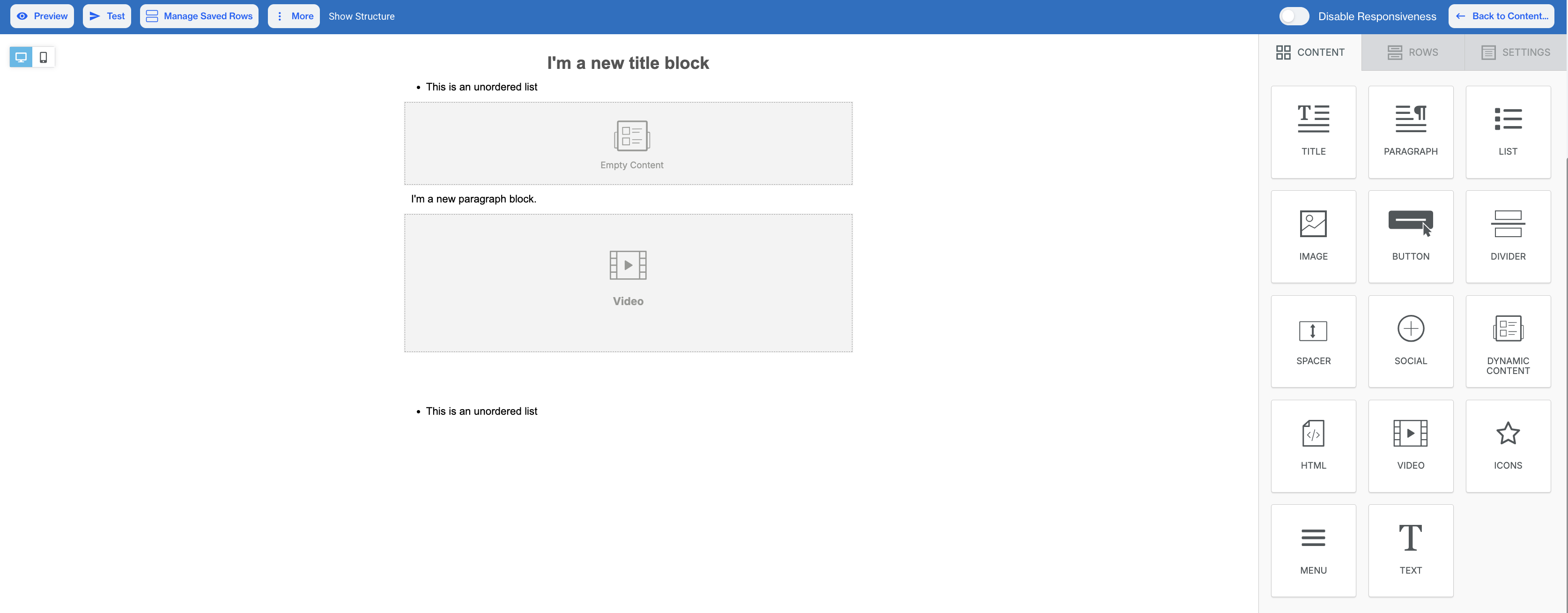
The screen is divided into two main sections. On the left side, you will find the "Drop Content Blocks Here" area, where you can drag and drop elements to build the structure and content of your email. On the right side, there are three key categories:
- Content – This section contains various elements such as paragraphs, images, buttons, and more, which you can drag into the content area.
- Rows – In this section, you can select different layout structures, such as one-column, two-column, or multi-column rows, to define the layout of your email.
- Settings – This section allows you to adjust overall email settings like background color, default font, and other visual elements that affect the appearance of your entire email.
You can freely switch between these categories to customize the design and layout of your email.
Content
In the Content section of the Email Builder, you will find a variety of content blocks that can be dragged and dropped into your email to create the desired layout and design. Below is an explanation of the key elements you can use:
Email Builder
Title: A text block used to add headings or titles to your email. You can format the text as needed.
Paragraph: Allows you to add blocks of text, such as descriptions or messages. You can style the text with formatting options.
List: This element helps you create unordered (bullet) lists within your email content.
Image: To add an image, drag the image block into the content area or click "Browse" to upload an image from your file manager.
Button: In the Button element configuration, there are three main sections: Action, Button Options and Block Options.
- Action: This section allows you to define what happens when the button is clicked. You can choose from the following link types:
- Open Web Page: Enter the URL you want the button to direct users to when clicked.
- Send Email: Opens the user’s default email application with a pre-filled address, allowing them to send an email directly.
- Make Call: Enables the button to initiate a phone call when clicked, ideal for users on mobile devices.
- Send SMS: Lets users send a text message from their device by clicking the button, typically for mobile users.
Additionally, you will find the URL field, where you can input the desired web address for the link. If needed, you can also select Special Links such as:
- Unsubscribe: Adds a pre-defined unsubscribe link for users to opt out.
- Brand Unsubscribe: Similar to unsubscribe but specific to brand preferences.
There's also the Link File option, where you can attach a file from the file manager. You can either upload your own file or search for free photos to use.
- Button Options: Include various customization features, such as font size, background color, alignment, and content padding, allowing users to tailor the button's appearance and behavior to fit their email design.
- Block Options:Include features like padding adjustments, visibility settings to hide on mobile or desktop views, and options to hide in HTML or AMP formats. These features enable users to customize the button's appearance and functionality, ensuring it fits seamlessly within their email design and meets specific display requirements.
Divider: A visual line that separates different sections of content within the email.
Spacer: Adds vertical space between content blocks for better layout and readability.
Social: Allows users to add social media icons and links to their profiles, enabling recipients to connect easily.
Dynamic Content: Enables the inclusion of dynamic elements that can change based on user data or preferences.
Important Note on Dynamic ContentWhile adding Dynamic Content using the Insert button or Add Customization button in Advanced Personalization, these features may not function properly if an ad blocker is enabled in your browser. To ensure all personalization and customization options work as expected, please disable ad blockers while using the Email Builder.
HTML: Provides a section for users to insert custom HTML code for advanced formatting or features not available through standard options.
Video: Allows users to add a YouTube or Vimeo video by specifying the URL and providing a Title for the video. This enables seamless integration of video content within the email.
Icon: Enables users to add various icons to the email content. Users can choose from a selection of icons and customize their appearance, such as size and color, to enhance visual appeal and convey specific messages effectively.
Menu: Allows users to configure menu items, including text and link types. Users can choose from various link types, such as Open Web Page, Send Email, Make Call, or Send SMS. The component also includes options for setting the target (current page or new page), along with fields for the title and link file.
Text: Allows users to add customizable text to their email. Users can enter and format text content, including options for font size, text color,line height, and other formatting features. This component is essential for conveying messages effectively within the email.
Carousel: Allows users to showcase multiple images or content items in a rotating format. Users can upload images by either dragging and dropping files into the designated area or by browsing their device to select files.
Rows
The Row section provides extensive customization options for layout and design. For example:
- Backgrounds: Adjust the row background color and content area background color, with additional settings to fine-tune.
- Borders: Set content area borders and rounded corners for a polished look, along with other border customization options.
- Layout: Control vertical alignment, enable stacking on mobile, and manage visibility on different devices, with more layout-related features available.
- Dynamic Content: Set conditions to dynamically display content based on filters.
- Columns Structure: Customize column background color, padding, and other design aspects to better organize your content, along with further column-specific settings.
Settings
The Settings section allows users to configure general options that influence the overall look and feel of the email.
- Content Area Width: Adjust the width of the content area to optimize layout for different devices and screen sizes.
- Content Area Alignment: Set alignment options for the content area, ensuring text and images are presented as desired.
- Background Color: Choose a background color for the email to enhance branding and visual appeal.
- Content Area Background Color: Modify the background color specifically for the content area to create contrast and focus.
- Background Image: Upload or select a background image to add depth and interest to the email design.
- Default Font: Set the default font style for the text within the email to maintain consistency.
- Link Color: Specify the color of links to ensure they stand out and are easily identifiable by recipients.
Editor Top Options
At the top of the email editor, several options enhance user experience and functionality:
- Preview: View a real-time preview of the email to see how it will appear to recipients.
- Test: Send a test email to evaluate content, formatting, and overall presentation before the final send.
- Manage Saved Rows: Access and manage previously saved row templates.
- More: This dropdown offers additional functionalities, including:
- Export Template: Save the current email as a template for future use or sharing.
- Upload Template: Import an existing email template to edit or customize.
- Disable Responsiveness: Toggle this option to view the email without responsive adjustments. Responsiveness ensures that the email design automatically adapts to different devices and screen sizes, providing an optimal user experience across desktops, tablets, and mobile devices. Disabling it allows for a static layout review.
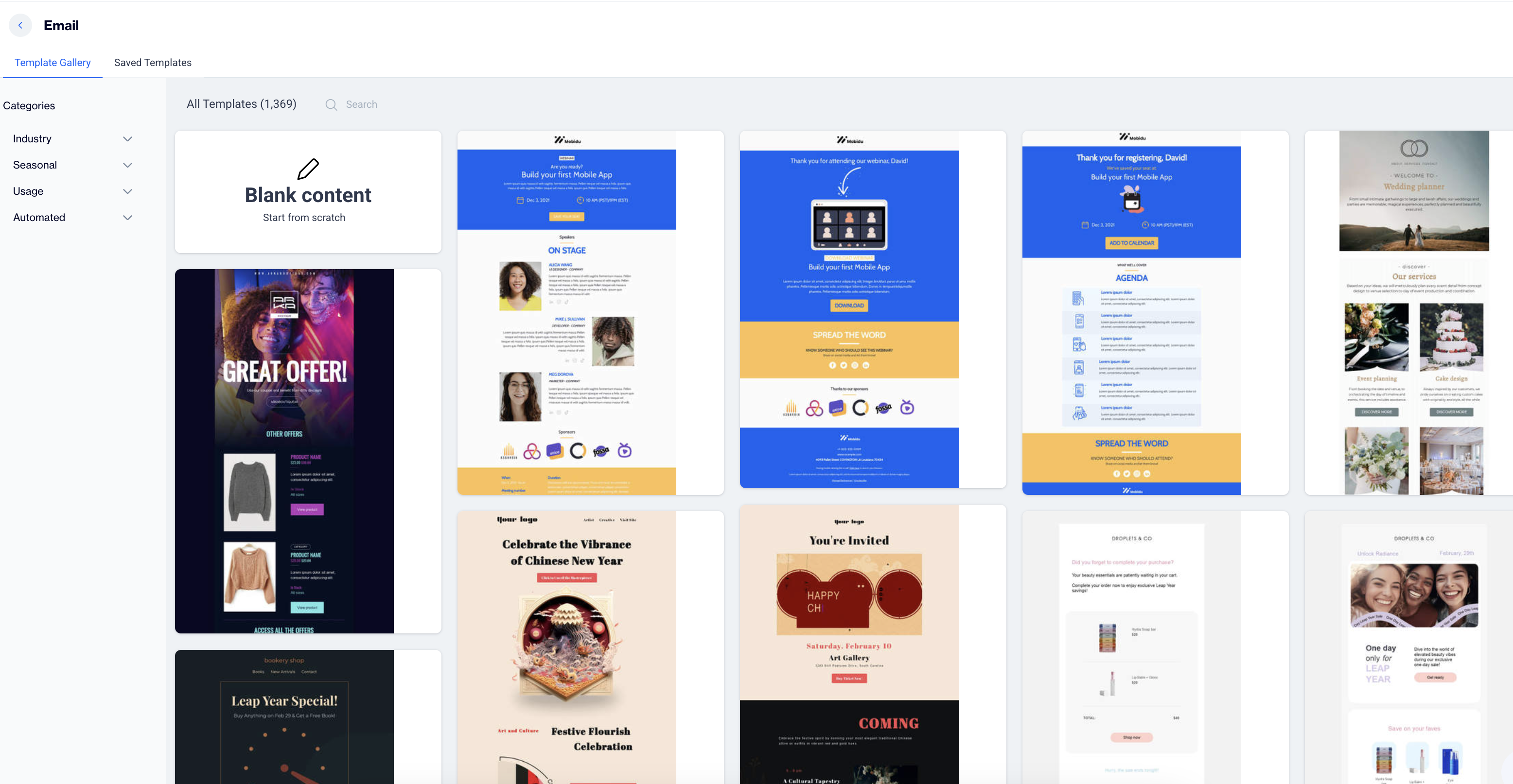
Email Content Template Gallery
The Email Content Template Gallery streamlines email creation by offering a rich library of pre-designed, customizable templates. Instead of starting from scratch, you can choose from templates organized by Industry, Seasonal events, Usage scenarios, and Automated communications. Each template is fully editable, enabling you to quickly adapt it to your brand’s needs and campaign goals.
Categories include:
- Industry – Tailored templates for different sectors:
Legal, Arts, Photography, Sports, Education, Media & Entertainment, Electronics, Pets & Animal Care, Non-Profit, Home Goods, Finance, Fashion, Small Business, Real Estate, Travel, E-commerce, Health & Wellness, Luxury, News & Magazines, Culture, Gaming, Software & Technology, Publishing, Music, Beauty & Personal Care, and more. - Seasonal & Holidays – Timely designs to match annual events:
Halloween, Christmas, New Year, Valentine’s Day, Ramadan, Hanukkah, Thanksgiving, Cyber Monday, Black Friday, Easter, Independence Day, Mother’s Day, Father’s Day, LGBTQ Pride Month, Kwanzaa, Juneteenth, Memorial Day, St. Patrick’s Day, Earth Day, Oktoberfest, Fashion Week, Back to School, Breast Cancer Awareness, Giving Tuesday, Chinese New Year, Leap Year, and many more. - Usage & Campaign Types – Goal-oriented templates for everyday campaigns:
Events, Product Launch, Service Promotion, Announcements, CV & Resumes, Instagram Bio, Mystery Campaigns, Business Services, Fundraising, Apps & Downloads, Weekend Sale, Wedding, Annual Review, Engagement, Personal Notes, Webinars, Product Promotion, Apologies, Re-Engagement, Teasers, Tutorials, Delivery Updates, Newsletters, Dark Mode Layouts, Surveys, Activism, and more. - Automated – Templates built for recurring or system-triggered messages:
Dynamic Products, Thank You Emails, Transactional Updates, Notifications, Confirmations, Abandoned Cart, Activations, Welcome Emails, Password Reset, and more.
With this extensive gallery, users can quickly launch industry-specific campaigns, and leverage seasonal opportunities.The breadth of options ensures a faster start while still allowing full customization to match brand identity.
How to Access and Use the Email Content Template Gallery
Access the Template Gallery
- Go to Content > Email > New.
- Click on Email Builder to open the Template Gallery.
Template Gallery
Choose a Template
- Browse the gallery to view a variety of template options.
- Hover over any template to see two options: View Template or Use.
- Click Use to select a template.
Customize the Template
- Enter a name for your email template and click Next.
- Fill out the content section as required.
- Click on the template to modify it as needed.
Save and Publish
- When you're done editing, click the Back to Content button in the upper-right corner of the email builder.
- Save your email as a draft or publish it when ready.
Related Articles
Email Builder
The Email Builder provides a versatile interface for creating and managing email templates. It includes a Template Gallery with categorized templates (Seasonal, Automated, Usage, Industry) and a Saved Templates section for easy access to custom or ...Email
Can I create my own email template? Yes, you can create your own email Newsletter template via CXDP’s Email Builder (a drag and drop editor used to create attractive Email Newsletters quickly). Can I add gif to an email? Yes, you can add GIFs in the ...Email
The Email Module is a versatile and user-friendly platform that facilitates creating, personalizing, and managing email campaigns to meet a range of user needs. The Email Module provides an all-in-one solution for creating emails that range from ...Onsite Builder
Onsite Drag and Drop Editor (Onsite Builder) The Onsite Builder is a new feature that introduces a drag-and-drop interface for creating onsite content. It allows users to design banners, pop-ups, floating bars, and more using a visual editor—without ...In-App Builder
The In-App Builder is a new feature that introduces a drag-and-drop interface for creating in-app content. It allows users to design banners, modals, and more using a simple visual editor, without the need for HTML or coding skills. How to Access ...