Modal
The In-App Modal is designed to present both an image and a text message to users within the app. This template offers a highly engaging way to communicate key information or promotions, ensuring visibility and user interaction in a modal format.
Creating a Modal
Modal
Name: Input a name for your In-App Modal to ensure it is easily identifiable and well-organized.
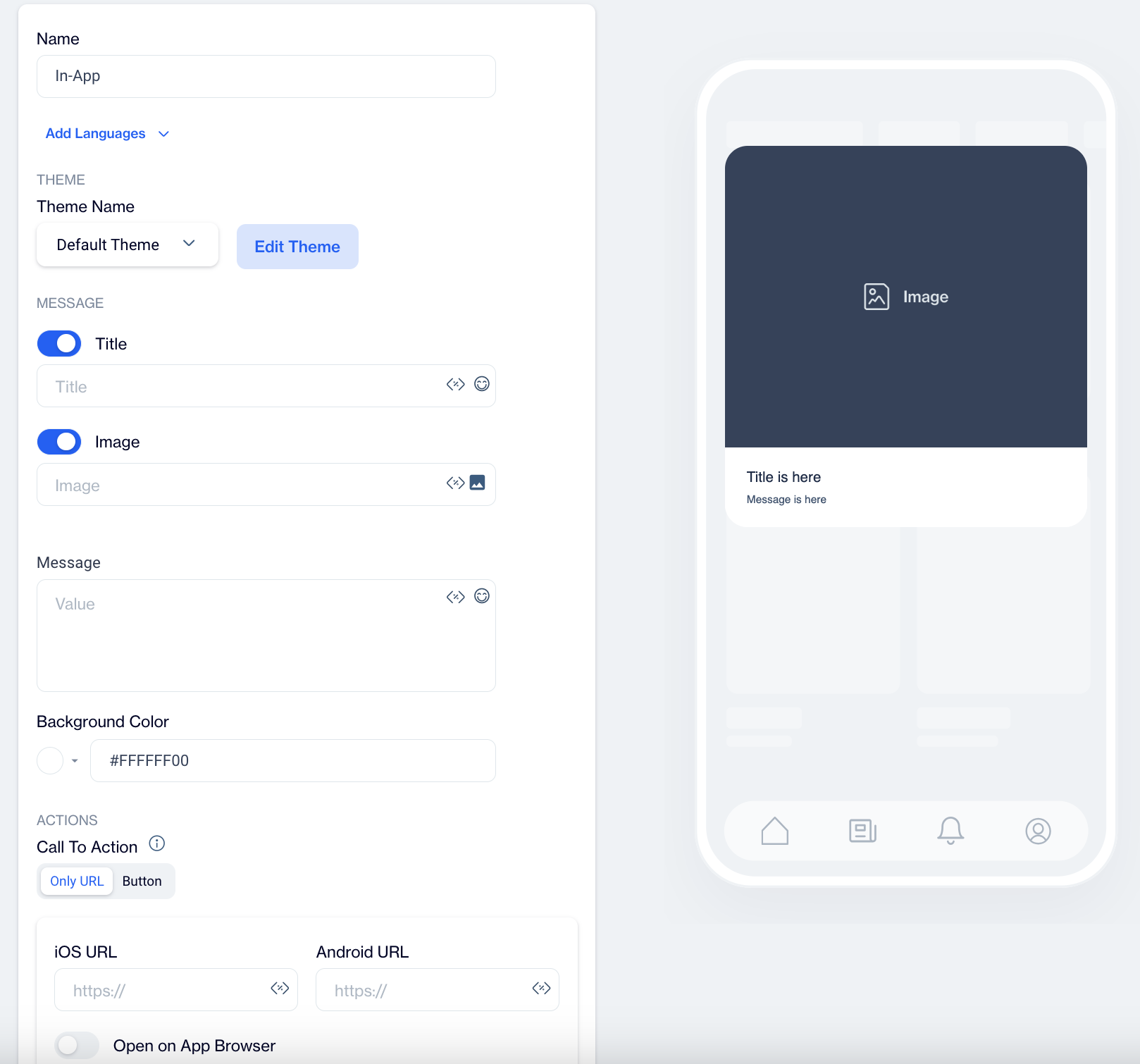
Preview on Mobile:Once you select the In-App Modal template, you can preview how the modal will appear on mobile devices. The preview will be displayed on the right side of the screen.
Add Languages:To ensure your message reaches a wider audience, you can add multiple language versions of your In-App Modal. When adding a new language, you have two options:
- Copy from Content: Duplicates the existing content to maintain consistency across languages.
- Create Blank Content: Starts with a blank template, allowing you to customize the content for the selected language.
THEME
Edit Theme:
In the Edit Theme section, customize the appearance of your In-App Modal by adjusting various parameters:
- General
- Font Family: Choose a font such as Helvetica or Roboto.
- Background Color: Set a background color for the modal.
- Card Radius: Adjust the radius of the modal's card (e.g., rounded corners).
- Card Padding: Set padding inside the modal to create spacing between content and the edges.
- Margin Top (px): Define the top margin to control space above the modal.
- Margin Bottom (px): Set the bottom margin to control space below the modal.
- Margin Right (%): Specify the right margin as a percentage.
- Margin Left (%): Set the left margin as a percentage.
- Message:
- Message Color: Choose the color for the text message.
- Font Size: Set the font size of the message text.
- Text Align: Align the text (left, center, or right).
- Weight: Set the font weight (normal or bold).
- Title:
- Title Color: Define the color for the title text.
- Font Size: Set the font size for the title.
- Text Align: Align the title text (left, center, or right).
- Weight: Choose the font weight for the title (normal or bold).
- Buttons:
- Font Family: Select a font for the buttons, such as Helvetica, Arial, or sans-serif.
- Font Size: Set the font size for the button text.
- Button Radius: Adjust the button's border radius (corner roundness).
- Weight: Set the font weight for button text (normal or bold).
- Fit Content: Enable this option to automatically adjust the button width to fit the text.
- Primary, Secondary, & Tertiary Buttons:
- Background Color: Set the background color for the buttons.
- Text Color: Define the text color for the button.
- Border Color: Choose the border color for the button.
- Border: Set the border thickness for the button.
- Close Button:
- Icon Color: Choose the color for the close (X) icon.
- Icon Size: Specify the size of the close button.
Once you have made the changes, click Save as New. A pop-up window will appear, prompting you to name your new theme. Enter a name for the theme to easily identify it later and click OK.
MESSAGE
- Title:
- Enter your title text. You can enhance engagement by adding Customization and Emojis to your title.
- Image:
- Add an image to the modal using the Image Selector. You also have the option to add Customization to modify the image further.
- Message:
- Input the message content for the modal. Customize the text with Customization and Emojis to personalize the message.
ACTIONS
Call to Action Options
- Only URL
- With this option, users are directed to a specified URL as soon as they click on the In-App Modal. This setup is ideal for quick navigation without any buttons.
- Button
- With this option, users are only directed to a URL when they click a designated button within the Modal.
Choose the action for the button when users interact with the In-App Modal:
Button Action Type: Choose the action that occurs when users interact with the modal button:
- Open URL: Directs users to a specified URL. Use this option if you want the modal to send users to a website or landing page, such as a product page.
- Dismiss: Closes the modal. Choose this option if the modal is only for informational purposes and does not require further action.
- Permission Prompt: Requests permissions from the user. Select this option if the modal leads to a feature that requires notifications, such as asking for notification permissions.
Primary Text Button: Customize the text on the modal's button (e.g., "Submit", "Get Started") to clearly communicate its purpose.
iOS Button URL & Android Button URL: Provide specific URLs for iOS and Android platforms if you need users to be directed to different pages based on their device.
Toggles:
- Open on App Browser: Opens the link within the app’s browser, keeping users within the app while they view the content.
- Retrieve Link on Same Screen: Opens the URL on the same screen without navigating away, maintaining user focus on the current page.
- Show Rating After Click: Displays a rating option after the button is clicked, allowing users to provide feedback on the modal's content.
How to Configure Secondary and Tertiary Buttons:
- Select the Button Type: Choose whether you want to configure the secondary or tertiary button by selecting the appropriate button type in the editor.
- Set Button Action: Choose the Button Action Type that best fits the purpose of the secondary or tertiary button, such as "Dismiss" or "Tertiary Button Text" like "Remind me Later".
- Customize Button Text: Input the text for the button (e.g., "Remind me Later", "No Thanks", etc.) to reflect the action the button will perform.
- Add URLs: If necessary, provide separate URLs for iOS and Android users. This ensures a personalized experience based on the platform.
- Enable Toggles: Decide whether to enable toggles like Open on App Browser, Retrieve Link on Same Screen, or Show Rating After Click based on your specific needs.
Close Button: Adds a close (X) button to the modal, allowing users to dismiss it if they do not wish to engage with it.
Dismiss on Touch Outside: Closes the modal when users tap outside its boundaries. This option is useful for modals that users might want to exit quickly if they are not interested.
Once your In-App Modal content is successfully generated, you can make any necessary changes and save it as a draft for future use. When you’re ready to launch the campaign, publish the content to prepare it for your in-app campaigns.
Related Articles
Image Modal
Image Modal The In-App Image Modal is designed to display an image alone within the app, providing a simple yet effective way to showcase visuals for promotions or announcements. This template maximizes visibility and is effective for visual ...Spam Checker
This feature helps to improve the deliverability of email campaigns. Overview Email Spam Score feature uses the 3rd party tool named ‘Spam Assassin’. This tool is a simple tool that only receives email content and calculates the spam score of it. ...Image Library
This segment outlines the folder structures for all images. The system also allows for the addition of new folders. Images are organized within these folders, and you have the option to upload any image to a designated folder. Additionally, you can ...In-App Push Notification “Permission Prompt”
The Permission Prompt feature is designed to help companies secure push notification permissions from users who have downloaded their app but have not yet enabled notifications. This feature allows you to present a pop-up within the app to prompt ...Language Support for Onsite Template Content
The Language Support for Onsite Template Content feature allows users to create multilingual onsite content. Users can add languages to their content and manage them efficiently. When adding a language, they have two options: Copy From Content: ...