Story
The Story is an onsite element that allows you to integrate a visually engaging, story-like experience directly within the page layout. This feature is perfect for capturing user attention without disrupting their browsing experience.
Creating a Story
Story
Preview on Desktop or Mobile:
After selecting the Story template, users will see a preview on the left side of the screen, showing how the story content will appear on both desktop and mobile devices.
General Section
As with other onsite elements, the General Section is where users input the Name and Folder details to organize the Story effectively.
Content Section
- Change Template:
Users can switch between different templates by clicking the Change Template button, allowing flexibility.
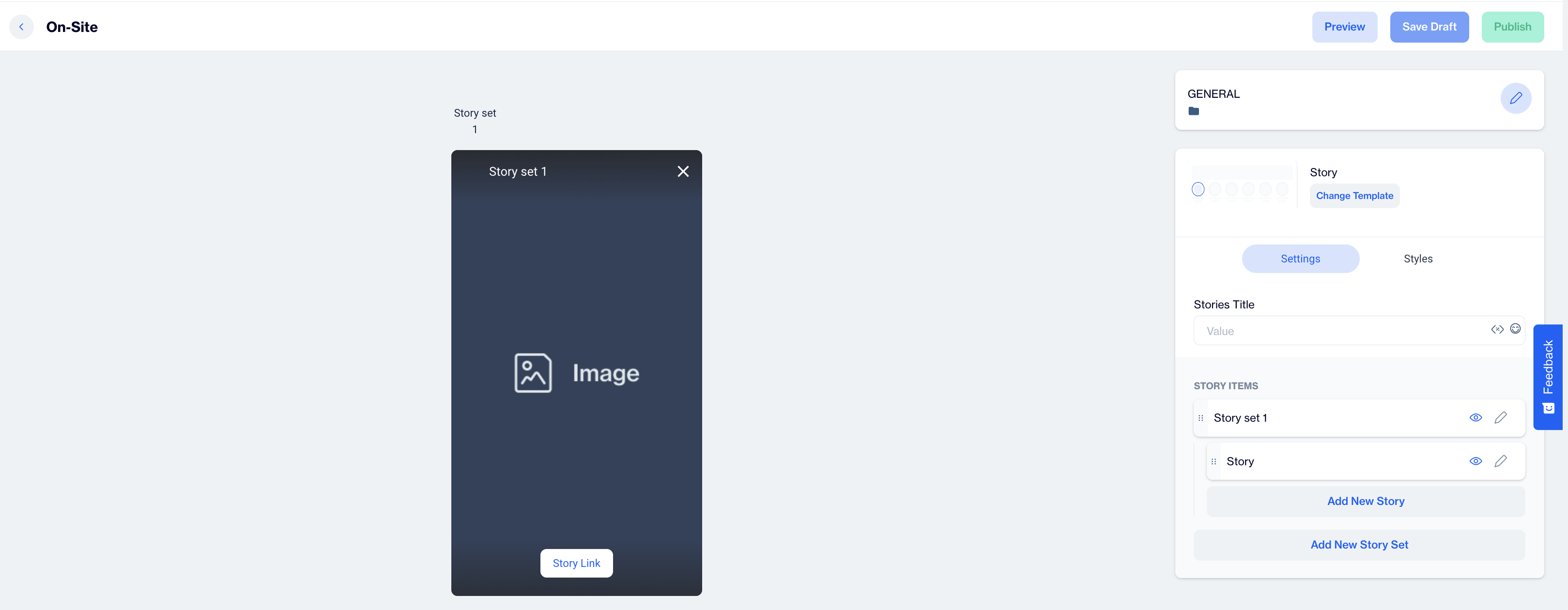
Settings
Stories Title
In this field, input the title for your on-site story.
Story Items
Story Set
Under the Stories Title, you'll find the Story Set section where you can set up and customize your story items.
- Edit Story Set Details: Click on the pencil icon to edit the story set details.
- Story Photo: Select a photo for story set using the following options:
- URL: Input a direct URL link to an image.
- Upload: Upload an image directly from your device to be used as the story photo.
- Story Stack Name: Enter the name of the story stack here to label the group of stories for organization and user recognition. You can add further customization options here to enhance the story’s appearance on the site.
Story
This section is dedicated to configuring the content of each individual story within your on-site story set. Here, you can set up media, background, and call-to-action (CTA) options to enhance user engagement.
- Story Photo: Upload a high-quality image to serve as the visual for your story, capturing users' attention or provide the URL.
- Story Name: Provide a unique name for each individual story within the story set. This helps in organizing and managing multiple stories effectively.
- Background Color: Customize the background color of the story to align with your brand or theme. Choose a color that complements the media and text to enhance visual appeal.
- Call To Action (CTA): Add a CTA to engage users and direct them toward a specific action. The following options are available:
- Text: Enter the text for the CTA button (e.g., "Learn More," "Shop Now") to make the action clear to users.
- URL: Provide a URL that directs users to a relevant web page, product, or custom destination. You can also choose to open a new tab for a seamless browsing experience.
- Background Color: Choose a background color for the CTA button to make it stand out.
- Text Color: Customize the text color within the button to ensure readability and alignment with the overall design.
After making changes, users must click the Save & Back button to return to the previous screen.
Styles
In the Styles section, users can customize visual settings to match on-site stories with their website’s design. For the Stories Title, adjust the color, font size, alignment, and weight to fit your branding. Within each Story item, configure the size, and add a custom border radius for rounded or squared edges. You can also set border thickness, along with distinct colors for active and passive story borders These styling options ensure on-site stories integrate seamlessly with your website’s aesthetic.
After adding your content successfully, save it as a draft for future use or publish it to make it ready for your campaigns.
Related Articles
Story
The "Story" template allows you to create engaging, visually rich in-app messages designed to capture user attention and deliver content in a swipeable, story-style format. This feature is ideal for highlighting new features, promoting products, or ...Inline
The Inline Content template lets you embed content directly within the app, allowing you to tailor the experience to suit your visitors' preferences and needs. Creating an Inline Content Inline Name: Enter a name for your Inline Content to easily ...Creating In-App Content
The In-App Content feature enables you to deliver targeted messages and interactive content directly within your mobile app. This includes elements like banners, pop-ups, and other notifications designed to engage users, promote offers, and drive ...